| title | description | slug | tags | image | hide_table_of_contents | ||
|---|---|---|---|---|---|---|---|
Hand-drawn diagram aesthetic |
How you can make diagrams look hand-drawn in D2 |
hand-drawn-diagrams |
|
false |
import CodeBlock from '@theme/CodeBlock'; import Animated from '@site/static/blog/sketch/animated.d2';
Sketch mode started out as a "wouldn't it be cool" weekend feature, and has since turned into one of the things people love most about D2.
When you pass the sketch flag like so, you'll get a diagram that kind of looks hand-drawn.
d2 --sketch input.d2
Most of the credit here goes to RoughJS for providing such an excellent library for converting normal SVG paths into imperfect ones, making the slight inaccuracies that our hand might when whiteboarding these types of diagrams in real life. Preet is an example of just a solo developer responsible for maintaining a small project that's behind-the-scenes for what is now a good chunk of a lot of diagrams you see on the web today! Please consider sponsoring him if you like this aesthetic.
For the most part, the implementation was as simple as using this library to convert paths, tune the parameters (e.g. we don't want paths to look as roughly drawn as shapes), and pick an appropriate font to match the aesthetic. Since D2 runs on Go and RoughJS is obviously a Javascript library, we embed a pure Go Javascript-runner as the bridge.
However, we did make one significant modification to this method: background fills.
RoughJS comes with many default fill patterns, but we thought they were all too jarring
for diagramming. For example, this is a render on Excalidraw, another diagramming tool
that leverages RoughJS.
<img src={require('@site/static/blog/sketch/excalidraw.png').default} alt="excalidraw hand-drawn example" style={{width:'50%'}}/>
While this does emulate a color-pencil type of fill, true to a hand-drawn aesthetic, it also makes the contents hard to read. We looked into options like putting a mask on the text so it dodges those lines, but even if it solves that problem, it brings a sharpness to the diagram that looks a bit intense, like we're aggressively coloring in something.
The solution that our designer came up with is to overlay a subtle texture of streaks that blends into the background. And to make it visible on all colors, the method of blending changes depending on how bright the background color is.
<img src={require('@site/static/blog/sketch/overlay.png').default} alt="streak texture overlays" style={{width:'100%'}}/>
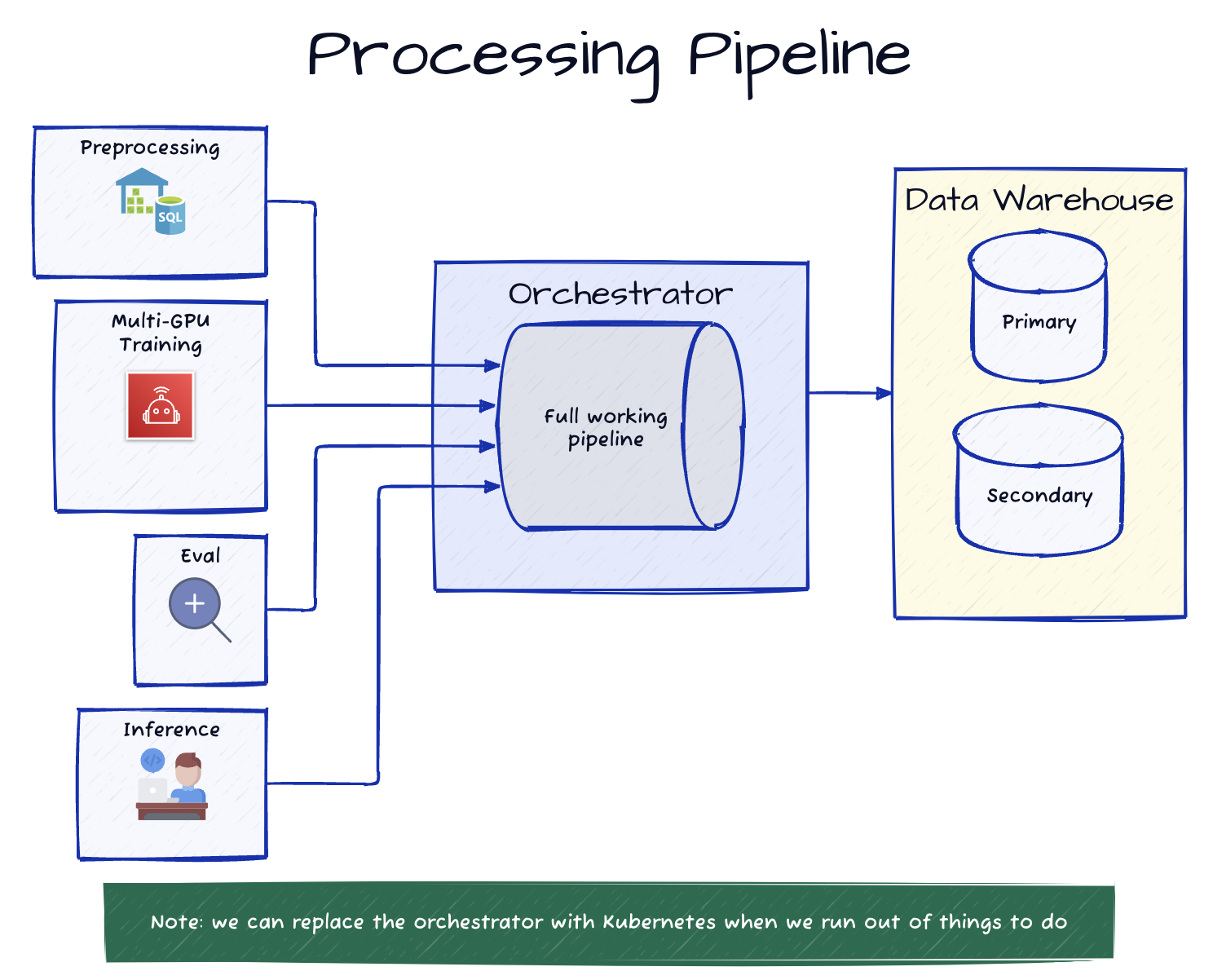
If you inspect the main diagram of this post, you can see it in effect with the various brightness of fills.
It even works with animated connections!
{Animated}