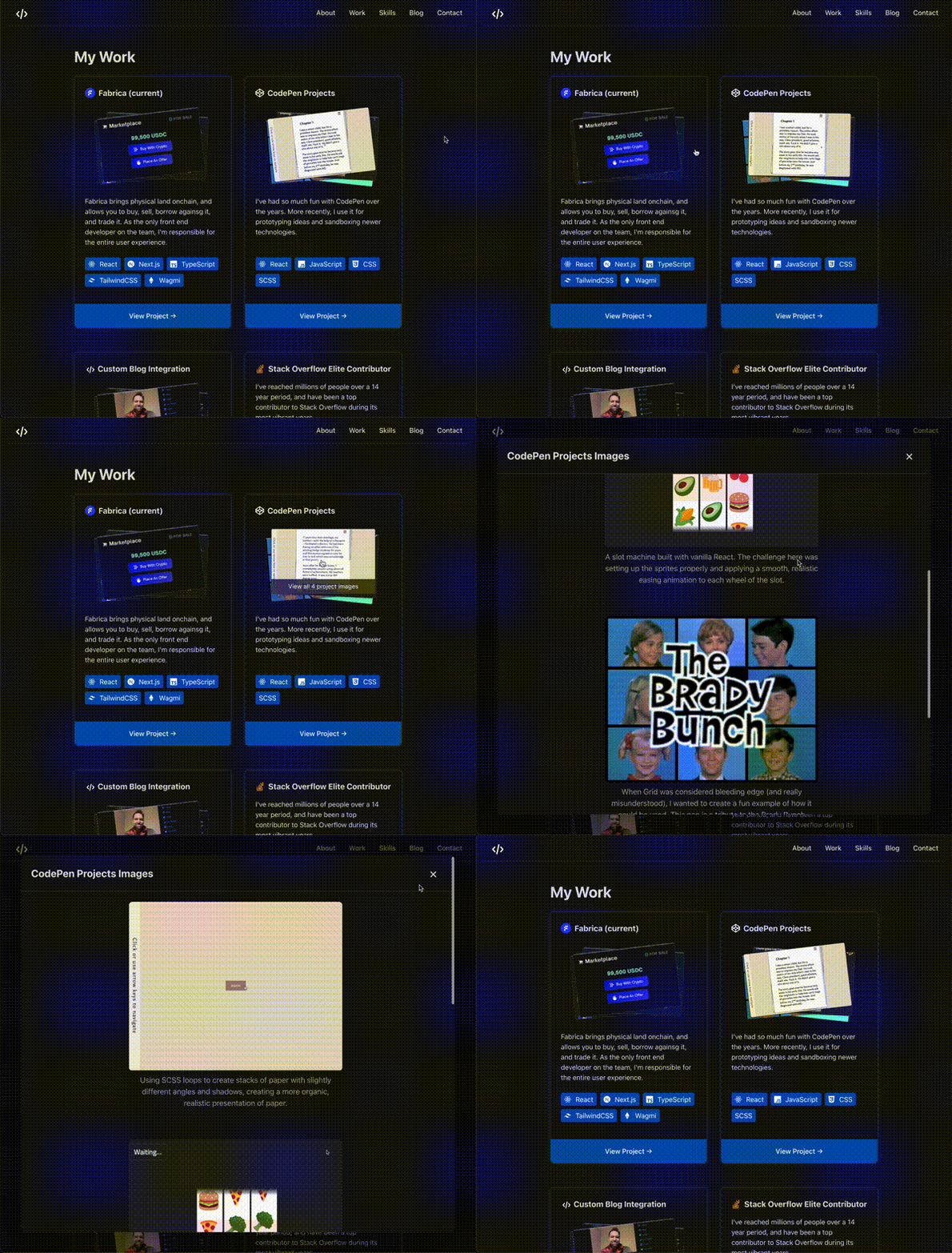
A React component for creating beautiful, interactive image stacks with configurable aspect ratios and responsive behavior.
- 🖱️ Hover over the stack to see the caption and animation effects
- 🔍 Click to open the full-size image gallery
- ⌨️ Press
Esc, click outside, or use the close button to dismiss the dialog - 👆 Swipe left/right between images for a completely responsive experience
- 🖼️ Stacked image presentation with hover effects
- 📐 Configurable aspect ratios (predefined or custom)
- 📱 Responsive design with mobile-first approach
- 🎭 Dark mode support
- 🔍 Modal view for full-size images
- 👆 Touch-optimized swipe navigation for when you don't want the full dialog experience
- ✨ Smooth animations and transitions
- ♿ Accessibility-friendly
npm install img-stacksyarn add img-stackspnpm add img-stacksimport { ImgStack } from "img-stacks";
function MyComponent() {
const images = [
{
src: "path/to/image1.jpg",
alt: "Description of image 1",
caption: "Caption for image 1",
},
{
src: "path/to/image2.jpg",
alt: "Description of image 2",
caption: "Caption for image 2",
},
];
return (
<ImgStack
images={images}
size={{ type: "aspect-ratio", width: 400, ratio: "wide" }}
/>
);
}Each image in the stack requires the following properties:
interface StackImage {
  src: string; // URL of the image
  alt: string; // Alt text for accessibility
  caption: string; // Caption shown in the dialog view
}The component supports two types of size configuration:
{
  type: "aspect-ratio";
  width: number; // Desired width in pixels
  ratio: AspectRatio; // Predefined ratio or custom number
}
Predefined aspect ratios:
"square"(1:1)"landscape"(4:3)"wide"(16:9)"ultrawide"(21:9)"portrait"(3:4)"tall"(9:16)
Or use a custom numeric ratio (e.g., 2.35 for cinemascope).
{
  type: "fixed";
  width: number; // Width in pixels
  height: number; // Height in pixels
}The component is inherently responsive:
- Uses the specified width as a maximum
- Automatically scales down on smaller screens
- Maintains aspect ratio at all sizes
- No horizontal scrollbars
<ImgStack images={images} /><ImgStack
images={images}
size={{ type: "aspect-ratio", width: 300, ratio: "square" }}
/><ImgStack
images={images}
size={{ type: "aspect-ratio", width: 400, ratio: 2.35 }}
/><ImgStack images={images} size={{ type: "fixed", width: 400, height: 300 }} />- Use same-size images for best visual results
- Provide meaningful alt text for accessibility
- Keep image stacks to 3-5 images for optimal performance
- Use aspect ratios that match your content type
- Consider mobile users when setting widths
MIT
