[Bug]: Tabular Data and Tooltip only show date level precision #1468
Assignees

Labels
type: bug 🐛
Something isn't working
Comments
|
As mentioned in #1400. Downloading to CSV also removes the original values of the time data, making the export meaningless for any granularity below Day. |
RiyaJethwa
added a commit
to RiyaJethwa/carbon-charts
that referenced
this issue
Oct 3, 2023
… availabe in date
Sign up for free
to join this conversation on GitHub.
Already have an account?
Sign in to comment
What happened?
This is a continuation of #1400 which I believe to be a bug.
Issue 1: When defining a scaletype of
timein axis options and the data passed into the chart is indeed date+time, the tooltip helper used on several charts will only show Date level granularity formatting. When using higher granularity time series (hourly, minute, etc) this becomes problematic as the tooltip will only ever just display the current date in the following format:MMM d, yyyy.An example of this can be seen here:
https://codesandbox.io/s/5v1s9b?file=/App.svelte
Notice the granularity of the data is hourly but the tooltip displays only the date.
The issue in code is in two locations:
https://github.com/carbon-design-system/carbon-charts/blob/master/packages/core/src/components/essentials/tooltip.ts#L253
and
https://github.com/carbon-design-system/carbon-charts/blob/master/packages/core/src/components/essentials/tooltip.ts#L259
Issue 2: When defining a scaletype of
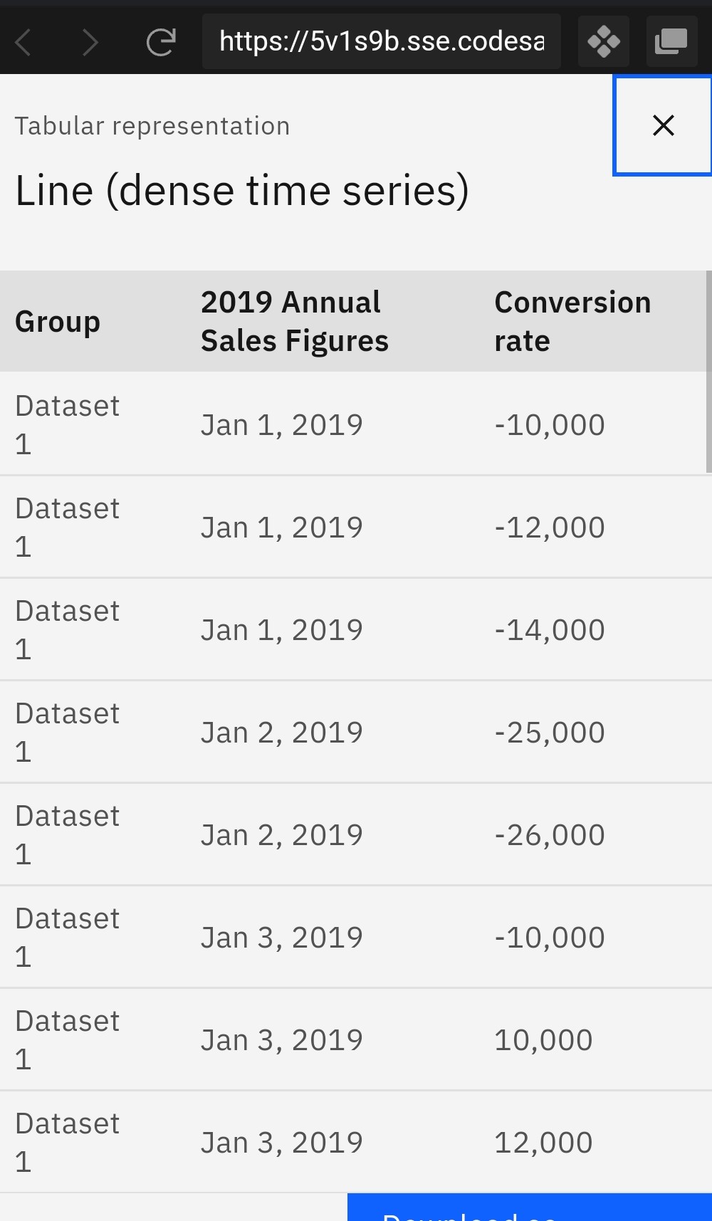
timein axis options and the data passed into the chart is indeed date+time, the tabular representation made available by several charts will again only show Date level granularity. This means viewing hourly, minute-by-minute,etc data in the table representation is not possible because the values are again formatted asMMM d, yyyy.An example of this can again be seen here:
https://codesandbox.io/s/5v1s9b?file=/App.svelte
Clicking on the tabular representation button will show that the table only displays the date even though the data is hourly.
The issue in code is in the following locations
https://github.com/carbon-design-system/carbon-charts/blob/master/packages/core/src/components/essentials/tooltip.ts#L259
I propose changing the formatting in all three places to
'MMM d, yyyy HH:mm:ss'in order to properly represent up to second level precision in these two features.Version
@carbon/charts@master
Data & options used
No response
Relevant log output
No response
Codesandbox example
https://codesandbox.io/s/5v1s9b?file=/App.svelte
The text was updated successfully, but these errors were encountered: