Flutter PoC to showcase all accessibility options
Building accessible apps should be one your main goals. App accessibility is about building products that are accessible to everyone, no matter their abilities. Making your app accessible may also help to broaden your user base, as allowing more people to engage with your application increases your DAU count.

In this sample project, you’ll learn how to add basic accessibility elements to your Flutter app, in order to:
- Help users with dyslexia.
- Consider people with color blindness.
- Enhance screen readers to assist people with visual disabilities.
- Increase readability by choosing eligible fonts, colors, and contrast.
- Inspect your app using Flutter’s integrated Semantics Debugger.
- Ensure tappable areas follow the recommended accessibility guidelines.
Disclaimer: Most of the text in this README is extracted from here.
Flutter has great built-in accessibility support. By making an app with Flutter, you get:
- Compatibility with large fonts.
- Response to scale factor changes.
- Support for screen readers, with some default semantics in built-in widgets.
- Great color contrast defaults: Both material and cupertino have widgets with colors that have enough contrast when rendered.
In addition, the Flutter Team compiled an accessibility release checklist for you to consider as you prepare your release.
However, there are always some improvements to do by code, specially with semantics. So this repo will try to fill that gap.
- Official docs
- Official best practices article
- Kodeco - Flutter Accessibility tutorial (recommended)
- Increase your product quality through accessibility
- Flutter Accessibility tutorial article (recommended)
- Improve app accessibility in Flutter
- Flutter Semantics in-depth
- Accessibility Best Practices in Flutter (recommended)
- Trigger Semantic actions in UI widget tests
- Yet another interesting example
- Widget Testing Part I
- Widget Testing Part II

People who have vision problems may find it difficult to read text in your app when it's the default size. Be aware of this text scale factor to make sure that the text within your app scales properly based on accessibility settings.
The built-in Text widget automatically handles the changing text size calculations based on the device's text scale
factor.
Flutter has a textScaleFactor property which is multiplied by the set/default font size to calculate the text's new
font size. That property is obtained from the MediaQuery.of(context).textScaleFactor.
Note that if you’re using a RichText Flutter widget, it won't support automatic text scaling. You’ll need to
explicitly
pass the textScaleFactor from the MediaQuery to the RichText widget’s textScaleFactor parameter.

People with vision impairments may also face issues using your app if there’s not enough contrast between different parts of your app.
The W3C recommends the following contrast ratios (CR) depending on the situation:
- 4.5:1 — If text is less than 18 points (24px) if not bold, and less than 14 pt (18px) if bold.
- 3:1 — If text is at least 18 pt if not bold and at least 14 pt if bold.

You can use online tools like contrast-checker and contrast-ratio to see if the CR of your colors meets app accessibility standards.
Both Android and iOS have accessibility settings to increase contrast. Flutter can read its state
using MediaQuery.of(context).highContrast boolean.

When you’re developing for mobile or any touch screen interfaces, you need to make sure that the tappable area for a button or any action is large enough that it can be tapped properly.
People with motor impairments may find it difficult to focus or concentrate their muscles on small areas and may find it challenging to tap the button if the tap target is too small. Even people with larger than average fingers may be frustrated by mis-tapping a small tap target.
The Android Material Design guidelines for touch targets recommend a minimum of 48x48 density-independent pixels (dp) for buttons, and Apple recommends at least 44x44 dp. They also recommend adding spaces of at least 8 dp between interactive components to make them distinguishable from the surrounding components; also, make sure to avoid overlapping tap targets.
In Flutter UI, the minimum tap target size is set to 48 dp, in line with the Material Design guidelines. The same size is also used for iOS and all the other platforms that Flutter supports.

People with some forms of vision impairments may access your app with screen readers. Screen readers provide spoken feedback so that people can use their devices without looking at their screens.
Based on a user's gestures or through external controllers like a keyboard, screen readers narrate the semantics of the components, say whether something is tappable or not, and then dictate the results of those actions and other information that may help the user navigate through your app.
By default, most Flutter widgets have some semantics. Flutter is smart enough to update those default semantics based on the data you pass to the required parameters of those widgets. Also, there exist Flutter widgets to provide semantics to custom widgets:
Semantics: annotates the widget tree with a description of the meaning of the widgets.MergeSemantics: merges the semantics of its descendants into a single one, useful to describe a group of widgets as a whole.ExcludeSemantics: drops all the semantics of its descendants, useful to reduce clutter and remove elements with no semantic values (background images or repeated content).
You can combine ExcludeSemantics and Semantics to provide a custom semantic to a group of widgets, for example.
Semantics have a lot of properties to fully customize the screen reader experience, such as:
- decreasedValue: the value that will result from performing a decrease action (e.g. a Slider)
- increasedValue: the value that will result from performing an increase action (e.g. a Slider)
- isButton: is the node a button or not
- isChecked: is the node a kind of checkbox, is it checked or not
- isEnabled: is the node enabled or not
- isHeader: is the node a header
- hint: brief description of the result of performing an action on this node
- label: description of the node
- value: textual description of the value
- liveRegion: to have content read automatically to the user as the result of some action
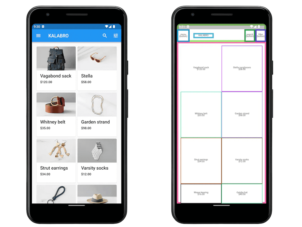
Also, to test the semantics, MaterialApp class has a showSemanticsDebugger property to replace all the widgets with
its semantic values.
Finally, Flutter has a SemanticsService to trigger some automatic TalkBack message, useful for example after a
purchase or to inform some result to the end user.
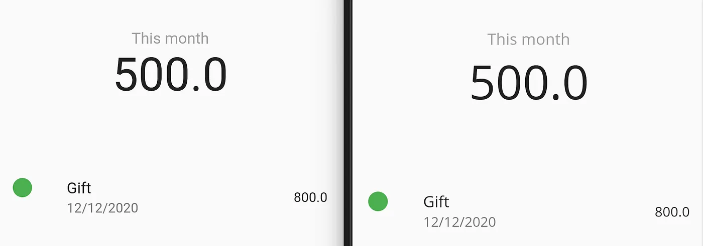
Since there are no specific tools to address this topic, it is encouraged to choose accessible fonts for users with dyslexia.
Dyslexia accessibility studies aren’t sure if the most popular font for Dyslexia, OpenDyslexic, actually helps people read faster. Most people prefer Verdana, Helvetica, or any Sans font. To select such a font family, you can use the Google fonts package or import manually your own fonts.
For example, in Flutter you can run flutter pub add google_fonts from terminal to add the Google Fonts package into
your app, and change the default font to a more suitable one. See this example, on the left, you see the standard font
for iOS, on the right OpenSans:
This is a Flutter package that adds checkers and tools to ensure your app is accessible to all. The tools only run in debug mode, and are compiled out of release builds.
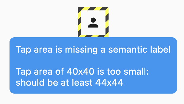
Ensures buttons (and other tappable widgets) have an associated semantic label.
For example, this icon button is missing a label:
IconButton(
  onPressed: () => login(),
  icon: Icon(Icons.person),
)
Adding a semantic label would fix this:
IconButton(
  onPressed: () => login(),
  icon: Icon(Icons.person, semanticLabel: 'Login'),
)Makes sure all tappable widgets are large enough to easily tap. Defaults to the Material Design minimum of 48x48 on mobile devices, and 44x44 on desktop devices.
Experimental: ensures that no flex widgets, such as Column and Row, overflow when a user is using larger font sizes. This checker is experimental, and disabled by default, and can be enabled via AccessibilityTools(checkFontOverflows: true).
Makes sure text fields (TextField, TextFormField, Autocomplete, etc) and inputs (Checkbox, Radio, Switch, etc) have semantic labels.
Flutter comes with
an Accessibility Guideline API to
check if your app's UI meets Flutter's accessibility recommendations, covering text contrast, target size and target
labels. The following example shows how to use the Guideline API to test accessibility in a demo widget:
testWidgets('Accessibility guidelines test', (WidgetTester tester) async {
  final SemanticsHandle handle = tester.ensureSemantics();
  await tester.pumpWidget(MyWidget());

  // Checks that tappable nodes have a minimum size of 48 by 48 pixels
  // for Android.
  await expectLater(tester, meetsGuideline(androidTapTargetGuideline));

  // Checks that tappable nodes have a minimum size of 44 by 44 pixels
  // for iOS.
  await expectLater(tester, meetsGuideline(iOSTapTargetGuideline));

  // Checks that touch targets with a tap or long press action are labeled.
  await expectLater(tester, meetsGuideline(labeledTapTargetGuideline));

  // Checks whether semantic nodes meet the minimum text contrast levels.
  // The recommended text contrast is 3:1 for larger text
  // (18 point and above regular).
  await expectLater(tester, meetsGuideline(textContrastGuideline));
  handle.dispose();
});
To test semantics, you can either just test if your widgets have the expected semantics, or you can go further and also test triggering the actions with semantic actions.
testWidgets('Semantics test', (WidgetTester tester) async {
  final SemanticsHandle handle = tester.ensureSemantics();
  await tester.pumpWidget(testWidget);
  await tester.pumpAndSettle();

  // Checks whether semantic nodes matches a regular expression.
  // It can be used with a string, matching by string equality.
  expect(find.bySemanticsLabel(RegExp('Enter a search term')), findsOneWidget);

  handle.dispose();
});

testWidgets('Semantics tap action test', (WidgetTester tester) async {
  await tester.pumpWidget(testWidget);
  final helloWorldTextFinder = find.text("Hello World!");
  final semantics = tester.getSemantics(helloWorldTextFinder);

  // Triggers the tap action associated with the semantics id and checks if the Snackbar appears
  tester.binding.pipelineOwner.semanticsOwner!
          .performAction(semantics.id, SemanticsAction.tap);
  await tester.pump(const Duration(seconds: 1));
  expect(find.byType(SnackBar), findsOneWidget);
});
After these instrumentation tests, it's recommended to test semantics in a real device with TalkBack (Android) and VoiceOver (iOS).
Important: Despite Google recommending Accessibility Scanner app to test accessibility, it's not currently working in Flutter (May 2023). Please refer to this Flutter repo issue for further information.
Android sample:
Sample.Android.mp4
iOS sample: